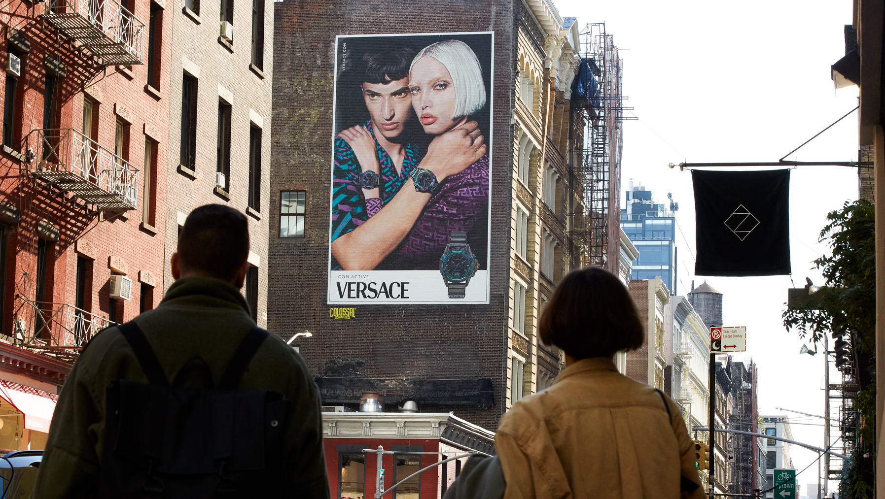
Big brands like Apple, Amazon and Molson Coors leverage OOH ad formats to boost brand awareness in communities and cities across the globe. Yet, creating successful out-of-home campaigns is a lot harder than it looks. Despite your best efforts, a poor choice in terms of a product photo, caption, or color could instantly lead to subpar results.
What are the common mistakes advertisers should avoid in their OOH ads? Here’s what you need to know.
1. Copy is too long
OOH ads are often seen when walking down the street or cruising along the highway. Due to these fast-paced environments, your ad may be overlooked if it’s too long or complex. A good tip is to keep it simple with a caption that's between 6 and 8 words.
Consider this ad by am/pm organic cafe, which uses a complicated flowchart to share its message.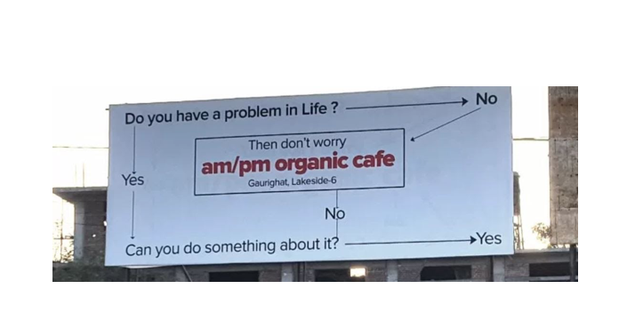
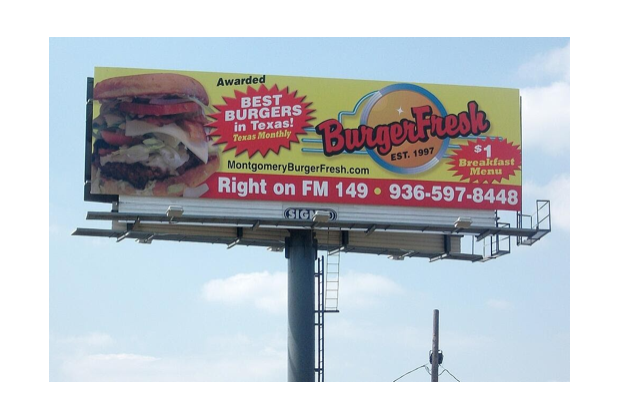
2. Unappealing product photo
An eye-catching product photo is key to attracting the attention of consumers. However, make sure it’s a quality image. Invest in a professional photographer to showcase your products in the best light. For instance, this billboard ad has an off-putting picture of a burger which may dissuade your target market.
3. Poor placement and line of sight
Location, location, location! Check whether the ad will be blocked by trees or other obstructions nearby. For example, this photo of a Les Miserables ad features the character's face partially covered by the LACMA pole banner.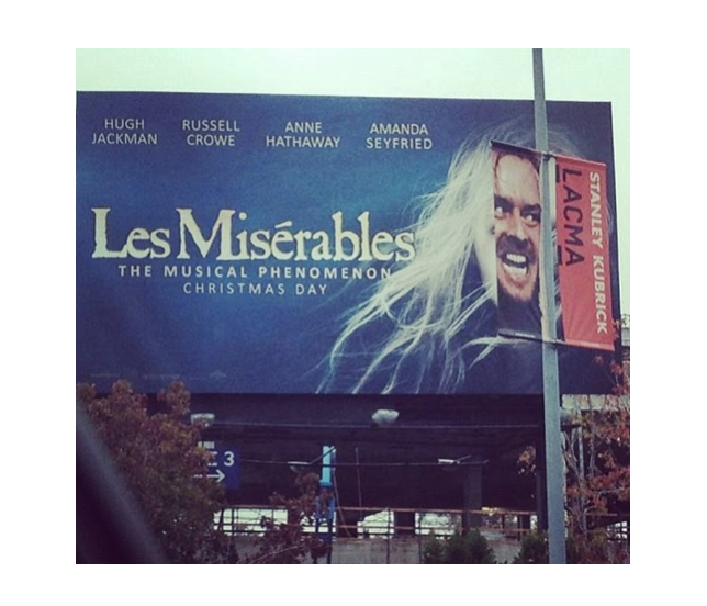
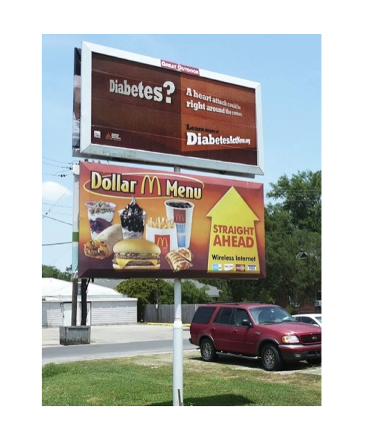
Make sure to understand your billboards’ surroundings, because poor placement or a neighboring ad could alter your message. This McDonald's OOH ad has an arrow pointing to a diabetes awareness campaign. This would likely discourage its consumers from visiting a restaurant.
Belgian designer, Diane von Furstenberg once said, “clarity is the most important thing. I can compare clarity to pruning in gardening. You know, you need to be clear. If you are not clear, nothing is going to happen. You have to be clear. Then you have to be confident about your vision. And after that, you just have to put a lot of work in.”
In this ad, there are appealing graphics and a large logo. Yet, consumers can't learn more information because the copy and website information is clearly too small and blends into a cloudy light blue background.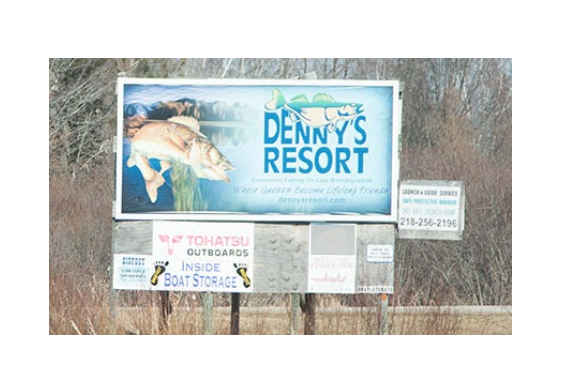
4. Not considering the context
To avoid negative PR, your ad shouldn’t have misleading copy or an alternative interpretation. Despite your best intentions, if you leave room for interpretation, viewers may take offense.
While the creators of this NIVEA ad likely did not intend to spark a racial debate, the message left too much room for interpretation. Ads like this may lead to misunderstanding and uproar in social media and culture at large, which can quickly spread and damage a brand's reputation.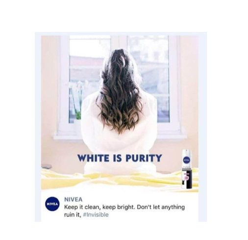
How will you succeed with your OOH campaigns?
Launching an OOH ad may intimidate brands trying it out for the first time, but avoiding common pitfalls will help you get the most bang for your buck.
We recommend keeping your copy short and simple so readers clearly understand your message. Include a good product photo to tempt viewers. Check product placement regularly and consider the context to avoid misunderstanding in order to achieve successful results.
Are you interested in getting started with OOH advertising for an upcoming campaign? Get in touch with our Billups managed and technology services specialists to learn more.
References
https://movia.media/moving-billboard-blog/2017s-worst-ooh-ad-campaigns-yet/
https://blog.kulturekonnect.com/9-billboard-design-fails
https://www.boredpanda.com/advertising-placement-fails/
https://www.canr.msu.edu/news/billboard_advertising_is_good_until_it_is_badvertising