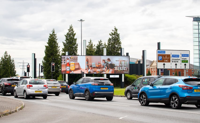
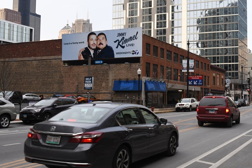
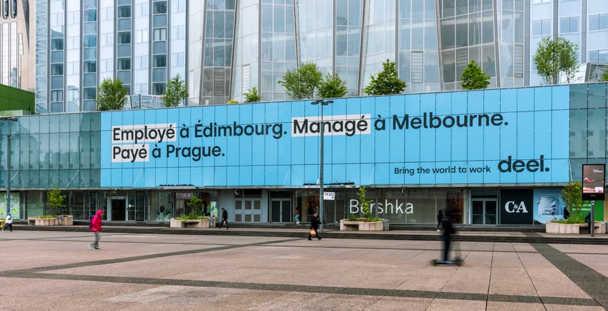
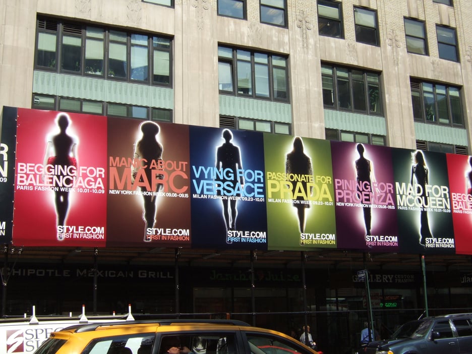
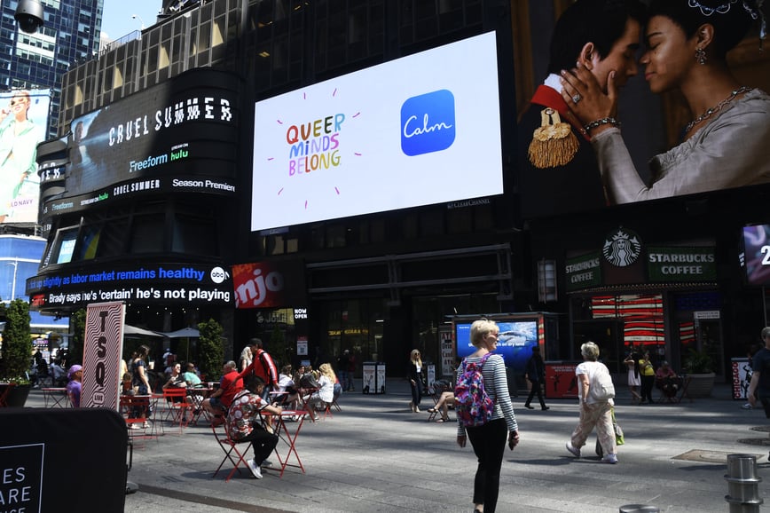
Out-of-Home (OOH) or outdoor advertising is a medium with endless opportunities and approaches for creative design. If you are new to outdoor advertising, you may think of OOH as a vanity play on a highway billboard, but there are actually a large variety of formats and shapes, endless locations and emerging technologies that help the imaginative advertiser to bring inspirational creations to life.
As a visual storyteller, you strive to surprise or excite your audience with your advertisements and should seek to innovate and try new things wherever possible. However, OOH design comes with some challenges, as concepts must be expressed with clarity and focus to entertain and intrigue your audience.
There are a few fundamental principles to OOH design and once you know what they are, you can play with the rules to create the most effective advertisements possible for your goals.
1. Use The Landscape in your Design
One thing that is unique about OOH is the way it exists in the physical environment of your audience. Permanent placements often become landmarks that are known and valued in the community. In addition to understanding the dynamics of your marketplace, you should consider the landscape and area where you want your placements to appear and how your audience might interact with that space. Here are some questions you might want to consider:
Where is my inventory located?
How many opportunities will my audience have to engage with my message?
High frequency is key to the medium. OOH designs have limited exposure time. You can ensure repeated exposures and that your message is retained over time by having multiple creatives and placements to give your audiences additional opportunities to engage with your message. OOH advertisements should be designed for short exposure times and require a disciplined and succinct creative approach.
If you are putting your OOH ad in a place where people tend to wait like an airport, train station or waiting room then your audience will have more time to digest the information than if your placement is on a highway or in a pedestrian district. Consider how long your audience will be exposed to your message and whether you can add additional details.
Is there a relevant or hidden message between the message or the environment that I can capitalize on?
Think about the environment of your placement. Your placement can be much stronger and more intelligent if you have an awareness of relevant or hidden relationships between your message and the environment.
For example, during the infamous fast food Chicken Sandwich Wars, Jollibee executed a campaign with inventory located next to and even on the property of its competitors.
2. Be Memorable and Tell a Story:
OOH executions that are innovative, aesthetic or humorous tend to perform better and be more memorable than literal advertising that simply shows your logo or product. OOH is most effective when you engage with not only your audience’s visual senses, but also stimulate their imaginations to elicit a visceral response.
Use Intrigue, Surprise and Humor
Intrigue is the element of mystery that you add to your creative. Use words or pictures that are not immediately understood. Ask the viewer to figure out your puzzle message through either a single intriguing design or multiple related designs that can be pieced together to immerse the viewer in a saga over time.
Surprise is using unexpected or unusual design elements that cause your viewer to do a double-take and elicit an emotional response once the message is understood. A powerful image with a searing headline can be an effective design choice for serious messages.
Humor often contains elements of surprise and intrigue to grab a viewer’s attention. Effective advertisements often have an element of wit, which encourages your audience to think about your message and therefore increases message retention.
Use Aesthetic Over Literal Designs
Aesthetic designs are pleasurable images or ideas that often depend more on pictures than on words. Aesthetic designs are often comprised of vivid, colorful photography or high-quality illustrations. Although pure branding and literal designs can be effective over an extended period of time, literal designs generally have the lowest recall among OOH audiences.
Tell a Story
Good advertising is storytelling. If you can create dramatic tension or suspense with your audience then you can encourage their interest on rational, emotional and cultural cognitive levels.
3. Keep it Simple
Because of OOH’s fast impact nature, the most effective designs focus on a single idea or concept. Provide a quick burst of essential information to your audience, focusing on the most important benefit of your product or service.
Including too much information or too many messages in your advertisement will dilute your message and reduce its impact. You should limit both text and design elements to avoid confusing your viewer. Sometimes a powerful image is all that is needed to entice your audience.
If your campaign requires multiple messages implement a series of designs that feature different core ideas presented as different OOH executions, rather than relying on a single placement.
To ensure you are following OOH design best practices OAAA recommends considering the following:
- Brevity. Focus on a core idea and express it concisely using simple messages and design elements comprised of limited words and pictures.
- Branding. Put your logo in a position that produces recall. The bottom right is a good location for horizontal placements. The top half of your design is better for vertical units.
- Borders. You are not confined to the boundaries of a frame. Crop generously and extend the elements of your design beyond the physical restraints of your unit. Extensions, 3D embellishments and environmental applications will produce a greater impact on your design.
- Boldness. Present dynamic or provocative messages.
4. Use Design Best Practices:
Basic design principles apply to OOH as well. It’s important to have an understanding of the colors, text and complexity of your design to create visually appealing advertisements that stay in your viewer's mind long after they’ve seen your placement.
Use Brilliant Colors
Designs bursting with brilliant colors evoke emotional responses that inspire lasting impressions. Use colors that have high contrast in both hue and value, especially if your viewing area is from a great distance. Colors with low contrast may blend together and obscure your message at long distances. Additionally, research shows that high color contrast can improve OOH advertising recall by 38 percent.
Look at the color wheel below to see the importance of contrast in hue and value. Opposites on the color wheel are complementary, for example, red and green. One would think that because of their contrast in hue that this combination would be effective for an advertisement. However, their values are similar, which makes it difficult for the human eye to process. This can create a quivering or optical distortion that makes your advertisement difficult to look at and understand.
You should avoid combinations of adjacent colors on the wheel like blue and green because they have similar hues and values, which creates a low contrast that makes your image blend together. Alternating colors on the wheel, such as blue and yellow are your safest bet as they have good contrast in hue and value.
Make Sure Your Message is Easy to Read
What good is your message if no one can read it? Though successful OOH campaigns don’t necessarily need any writing on them to be effective, ensuring the legibility of your text is vital.
Use large and legible typefaces that can be read from different distances. Avoid fonts with thin strokes or ornate script because they will be hard to read. Similarly, avoid typefaces that are too heavy and lose their basic shape when the viewing distance is increased. Ensure that you use adequate spacing between letters, words and lines to enhance visibility and consider the relative size of your characters to the size of your placement. A one-foot letter height is unreadable from a roadside, but a letter height greater than 3 feet is clearly readable.
A single horizontal line of text allows your viewers to read and understand your text quickly. If you need more than one line of text, then use adequate leading between lines and letters to ensure your message is legible. Avoid overcrowding your text with compressed type that can make your message difficult to read or even appear as a different message altogether!
5. Include a CTA
OOH is not just for awareness and branding. New technologies allow you to connect your other traditional and digital marketing efforts to your OOH placements. Include internet addresses, QR codes, telephone numbers or special offers in your message. Interactive mobile technology can also help you to connect to your target audience and track from viewing the OOH placement to the point of sale at a physical or online store. At Billups, we offer detailed attribution reports and have access to a variety of data points that can help you to measure the ROI and effectiveness of your campaign.
How Does Billups Help Me Design My OOH Campaign?
While we do not have an in-house design studio, Billups can provide strategic design recommendations for your OOH advertisement. Our experienced media planners can put together examples of work for inspiration depending on your OOH formats or target market. We also have access to an OAAA mock-up generator that allows us to review your creatives.
Want to learn more about how Billups can help you with your next campaign? Contact us today! New to OOH and want to learn more first? Check out our OOH Short Guide!
